Watson Health
We built a native application for IBM Watson Health to use as a key sales and educational tool at one of the nation’s largest healthcare conferences.
- Content Management
- User Experience Strategy
- Project Management
- Wireframing
- User Interface Design
- Creative Direction
- Quality Assurance
- Development Collaboration
The Challenge
With ASCO (the nation’s top Oncology conference) approaching quickly, IBM wanted to seize the opportunity to show off how Watson Health has revolutionized the industry and is pushing innovative boundaries in Oncology, Drug Discovery, and Genomics through cognitive computing. IBM wanted a captivating experience that would “wow” at the conference and could be used afterwards in the hands of their salespeople.
Our Solution
Five Acres partnered with Harbor Island Ventures to create a sales enablement app to increase sales and awareness for Watson Health by bringing their brand story and unique contributions in Oncology, Genomics, and Drug Discovery to life. We crafted a unique experience that introduces the story of Watson and Watson Health and allows the user to dive deeper and explore their own curiosities at their own pace.
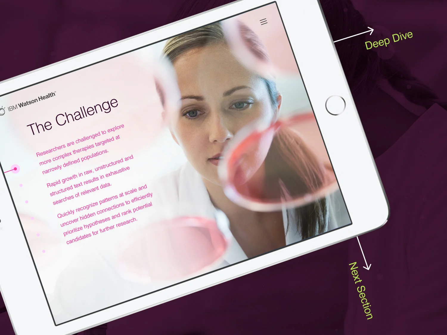
Swiping left to dive deeper into a topic, swiping up to move to next section.
Sharing knowledge instantly.
Complex information made easy to understand
We created a systematic structure for the app to allow consistent navigation across all three pillars so salespeople don’t get lost in complex content.
Throughout the app, scrolling vertically provides new categorical content while scrolling horizontally digs deeper into a category. Users have the ability to immediately email sales materials and collect contact information. At the end of each pillar, the salesperson is given the opportunity to send relevant documents and resources to anyone via email.
Humanizing technology through story and style.
We chose to reiterate the brand message, "Empowering Heroes, Transforming Health," by highlighting the stories of those impacted by Watson Health in order to engage the users and bring the human side to the technology. The stories of Watson Health heroes are at the access point to each pillar where users can watch a video and read impactful testimonials.
Next: Verta.ai Website
Strategy and a redesign for an MLOps site with bright colors, bold typography, and straight-forward messaging.
View Case Study All Our Work

Ready to level up?
We’re ready to get to work for you and with you. Our creative team will elevate your product and brand experiences to help you achieve your most important goals.


