Website Redesign
We designed product pages for this AI software brand that packed extra visual punch for an upcoming sales event.
- User Experience Strategy
- Wireframing
- User Interface Design
- Creative Direction
The Challenge
Verta needed an experienced team to help them quickly revamp their product pages for an upcoming event. Explaining artificial intelligence and machine learning products can be complicated, and they needed help communicating their offering in an understandable way.
Our Solution
Through several brainstorm and intake sessions with the Verta team, we were able to clearly understand what the company wanted to communicate about their platform offering. We organized the content so it was consistent and re-wrote copy so it was clear and easy to understand. A new design system was introduced to help highlight important information and expand on their existing branding.
Bringing clarity to content and the product ecosystem
We didn’t just edit site content: we introduced a new organizational structure—icon cards—to make it easier to understand and more useful throughout.
Verta wanted to better convey what each of their products do, as well as emphasize that they all work seamlessly together (versus the solo offerings of other companies). We simplified site content and designed custom icons and visuals to show how each product fits into the ML Ops process. We tied everything together with a brand new design system: flexible, interactive cards group related information together, while content blocks keep layouts consistent as the needs of the site grow and change.
Flexible sections, content blocks, and cards keep content organized, creating a cohesive look across Verta’s product family.
A new product overview makes the distinctions between each of Verta’s services and where they fit into a typical MLOps timeline simple and clear.
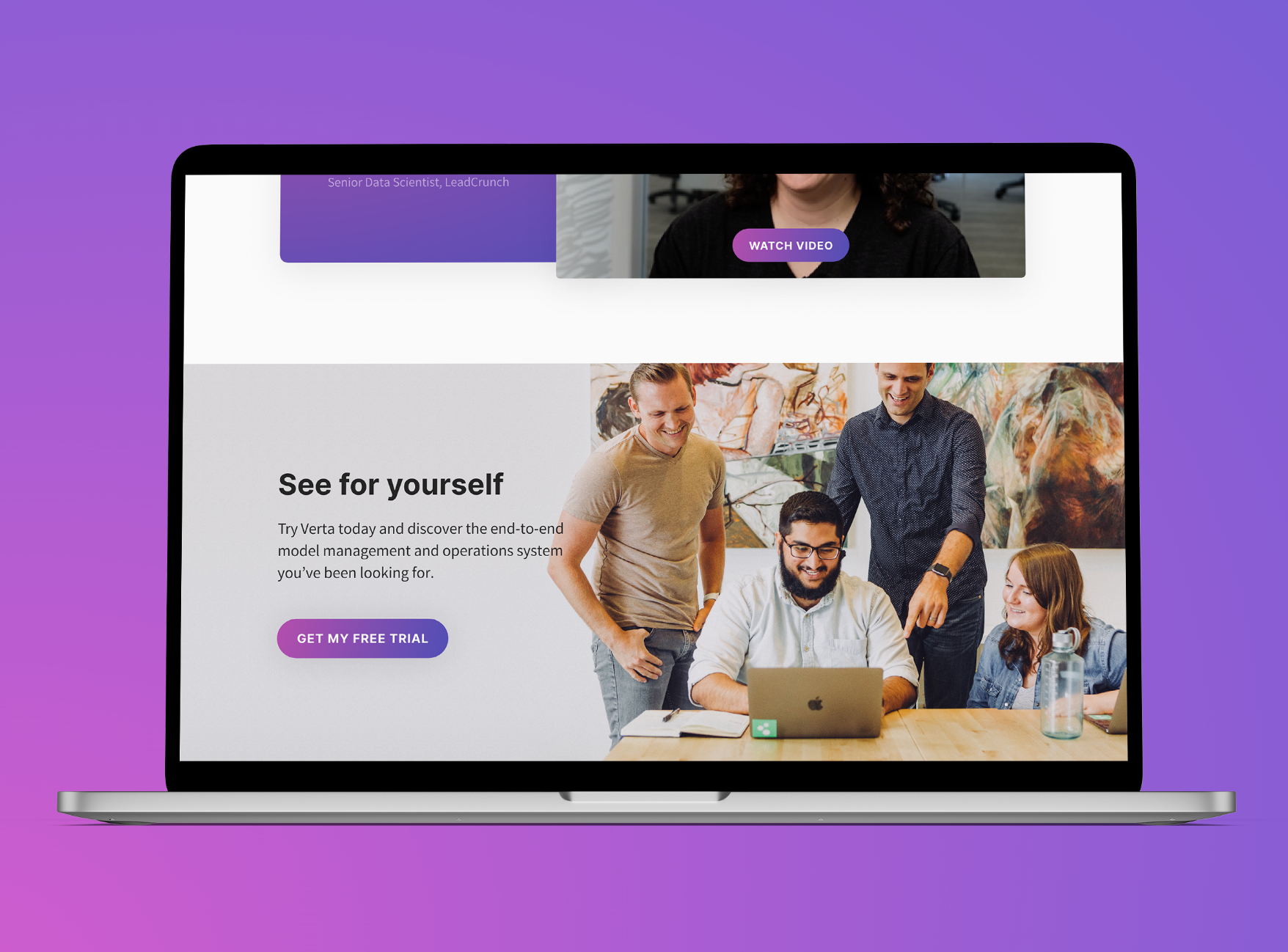
Video testimonials and trial call-to-actions place the emphasis on the experiences of real Verta users throughout.
Next: Marching Order Website Redesign
We designed a new experience for the Marching Order website to tell their impact story.
View Case Study All Our Work

Ready to level up?
We’re ready to get to work for you and with you. Our creative team will elevate your product and brand experiences to help you achieve your most important goals.


