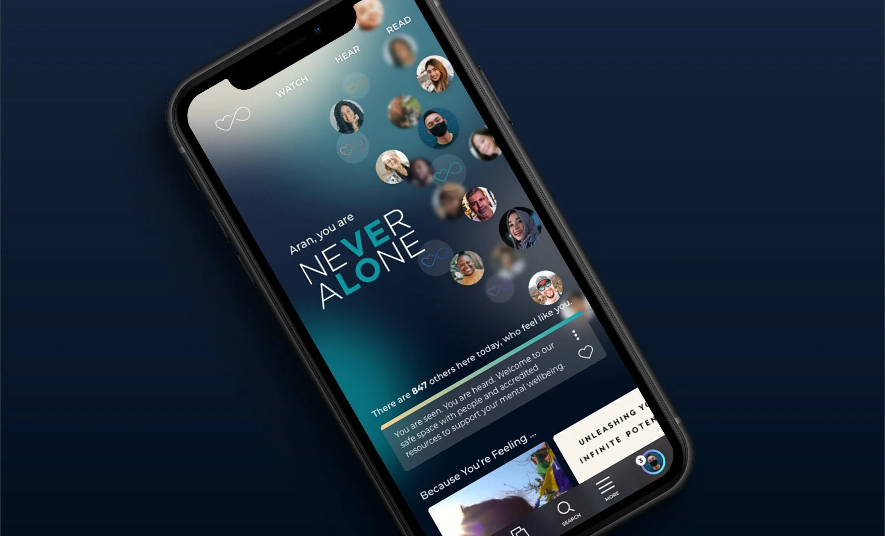
Never Alone Platform
We created an intuitive, accessible, diverse platform that serves the global community with engaging, accredited resources for mental health and wellness.
- User Experience Strategy
- Wireframing
- User Interface Design
- Creative Direction
The Challenge
When partner agency, CG Creative, asked us to help design a platform to support mental health awareness and suicide prevention we jumped at the opportunity. They looked to us to lead and develop a strategy for the platform experience from the ground up. We immediately saw the need for a robust discovery phase to define our collective goals, narrow down the global target audience into key personas, and understand modern user expectations for media platforms.
Our Solution
After careful consideration of our key personas, we uncovered five primary user needs: privacy/anonymity, validation through community, accredited resources, intuitive navigation, and personalized content. We designed and curated the platform feature-set around these needs and crafted unique, delightful, and organic interactions that brought them all together.
Strategy and UX built on user research, quality persona development, and purpose-driven feature set selection.
We designed a safe space to explore mental health content.
The visual language used in the application was designed to feel private, calm, and healing.
The mind is a magnificent mystery and our unique experiences define our perceptions of the world. There is no single visual that can symbolically capture mental health. To represent the inner workings of the mind and the infinite connection we have with each other we included the following:
Abstracted, blurred backgrounds used throughout the experience, color spectrum as a system to represent primary diagnosis, symptoms, or moods and animations and transitions in the application that feel natural, derived from nature in both pace and kinetics.
Primary content, customized directly by users and algorithms based on behavior
Built-in tools empower users to customize their experience and take control of their mental health.
Personalization empowers (and retains) users
One of our primary goals in creating the platform was to empower the global community in their own mental health journeys. By providing a fully customizable profile and mood journal for them to document their own content, users are given a space to track how they are feeling through bright visual cues and the ability to take notes. Tracking mood and journal entries in the calendar encourages users to re-engage with the application day in and day out.
Application structure supports promoted content, customized channels and delivers immersive design.
Next: Ziosk Flex UX
We provide design services for Ziosk and its partners in UX consulting, design, and copywriting for their new pay at the table experience.
View Case Study All Our Work

Ready to level up?
We’re ready to get to work for you and with you. Our creative team will elevate your product and brand experiences to help you achieve your most important goals.


